How The Metagame cards went from a sports card-like to dictionary chic
Five years of Metagame card designs
Over the last five years, The Metagame has transformed from a conference game to a party game, from there to an artist’s project bound into a magazine and finally back to a rebooted party game. Along the way, the visual design of the game has undergone one major reboot, three format changes and innumerable small revisions. At each turn, with each change, the visual design of the game has always been central to the success of the game. This is the story of the game’s visual design over its five year evolution.
2010: The Metagame Conference Game
Local No. 12 began designing the Metagame as a conference game for the 2011 Game Developers Conference. This meant the cards had to work in a wide range of circumstances—people standing in hallways chatting, players seated before or after conference sessions, in the poor lighting of a bar, in parties at 3am. We also knew we’d be dealing with people who knew games inside and out. This audience already spent a good deal of time talking about games, so we wanted to think through how to present the game in a way that dovetailed into their existing interests and activities.
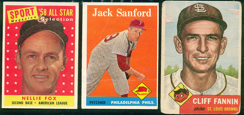
Mid-century baseball cards were a model for our early layouts
Early on in the project, we hit upon sports trading cards as a model. It made sense for the game in a number of ways. Since we were focused on videogames as the primary subject matter, the “facts + picture” model of trading cards worked well as a framework. In the case of baseball cards, the player’s name and likeness were the most important information, followed by their position and team. This suggested an information hierarchy for the Metagame game cards. We would feature the game’s title and an exemplary image, followed in importance by the publisher, developer, platform and date.
Summer 2010: the first playtested card design
With this in mind, we began experimenting with the basic composition of the cards. We quickly came up with a design that included the game’s title, image and salient information for differentiating which particular version of the game was up for debate. We spent a lot of time thinking about what kinds of images should represent the games. We experimented with screenshots, game logos, even fan art. In the end, we used a mix of these to convey the spirit of the game, and to help those who might not know it identify the game. We liked a horizontal image orientation, which favored high-definition videogames, but also gave the cards a strong visual presence.
We began playtesting a horizontal design that allowed large images. During our first large-scale playtest was at IndieCade 2010, we quickly realized that playing cards are vertical for a reason—it is much easier for players to hold an ever-expanding number of cards this way. Just as important, that is what players expected from playing cards. So while we liked the look of the horizontal layout and its strong visual appeal, we realized we needed to revise the design to fit the format people were used to. This was a recurring theme in the design of the game—finding the right balance between the visual design, the communication design, the play experience and the traditions of card design.
Spring 2011: card layouts used at GDC 2011
We went through a series of additional revisions to slowly hone in on a look that read “trading card,” had a vertical composition, contained the correct information, and used a representative image that got across the gist of the game. Even after a lot of testing, we realized there were some problems with our design. For one, right-aligning the game titles didn’t work well with the typical way players fan out cards in their hands—the titles became partially obscured. So while it may have looked better to right-align the titles, it was more functional to have them left-aligned.
We also struggled with the “flavor” elements of the card borders. In order to maximize the size of the images and information, we pushed our borders past the ¼” safe zone recommended by printers. And as a result, the variation in cutting created visible inconsistencies that would have likely been hidden by a more generous border margin.
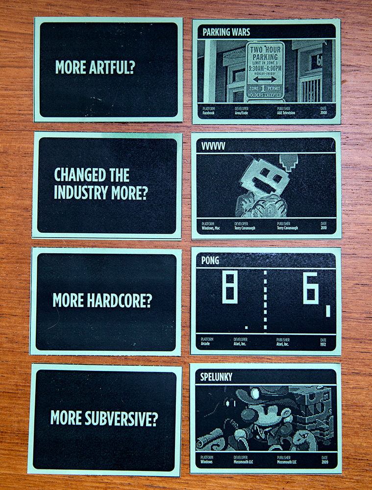
2012: Metagame Videogame Edition
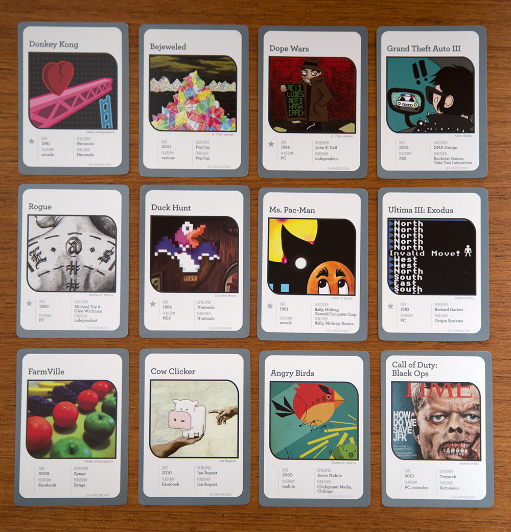
2012: Illustrations for the Metagame Videogame Edition.
The success of the Metagame at GDC 2011 lead us to run our first kickstarter campaign. We were overall happy with the look of the game, so we left the visual design more or less intact. We did make one substantial change to the comparison cards—we reversed out the text and background so the cards were white text on dark gray background. This gave the two decks more distinct looks. We also thought it gave the comparison cards a more cleaner, more designed look.
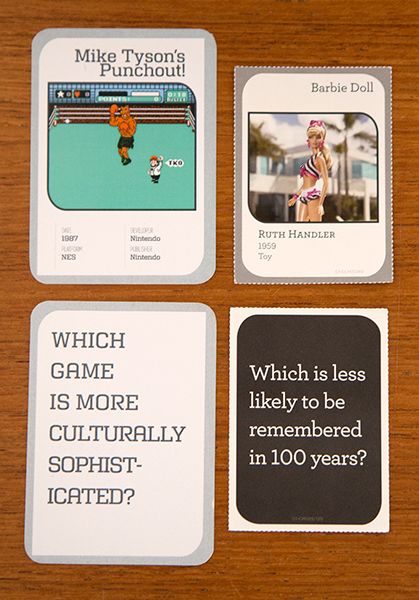
The main change came around the images on the game cards. Following the lead of collectible card games like Magic: The Gathering, we commissioned illustrations for each game card. We reached out to friends, colleagues and the internet to find a group of illustrators with a range of styles. We then let them pick from the list of games to pick their favorites. In the end, we had 20+ illustrators create the 100 images included in the Metagame Videogame Edition. These proved to be a real strength of the game, giving each card a distinct look within the more neutral look of the cards.
2013: Metagame Culture Edition
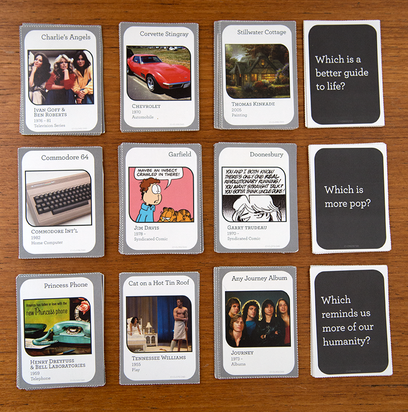
Fall 2011: Esopus #17 premieres “The Metagame (Culture Edition)”
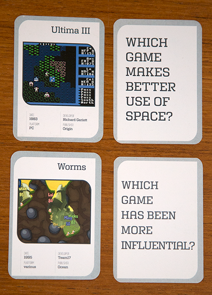
Later that year, Local No. 12 was approached by Tod Lippy of Esopus Magazine about doing an artist’s project. We quickly honed in on the idea of broadening the game to popular culture—film, music, art, literature, comics, architecture, fashion, product design, and of course, games. We also had to consider how to translate the game from a traditional card design to something that could be reduced in size to efficiently fit onto perforated sheets for binding into the magazine. So while the overall look-and-feel remained the same, there were innumerable design considerations around scaling down to a smaller, more narrow card size.
Poker-sized Videogame Edition cards on the left, the smaller Culture Edition cards on the right
One substantial change was to change the text on the comparison cards to upper/lower type instead of all caps. We felt this gave a greater elegance to the typography. On the culture cards, we also removed the labels for the creators, date and medium. Given the wide range of content we were working with, there wasn’t the same consistency as before. This also freed up some much-needed space in the smaller card footprint.
2013 – 14: The Metagame reboot
Summer 2013: roughly 25% of the tested prototype designs
Working on the Esopus Culture Edition got us excited about doing a commercial release of the broader culture edition of the game. We started by opening up everything about the game for conversation. Who will be our new audience? How would they best receive the information about the objects on the culture cards? How should we represent the objects? What will set the right tone for a broader audience?
We spent a good deal of time thinking through the pros and cons of photographs and illustrations. We eventually agreed on illustrations, and even more specifically, a single illustration style. We thought this was a good way to move away from the expectations of collectible card games, and toward a more mainstream approach to card game design.
Some of the more important conversations about the card design were with Max Temkin from Cards Against Humanity. He urged us to think about simplifying and streamlining the information on the culture cards in order to make them more accessible. This led to a long period of design explorations, prototyping and playtesting. We went through at least two dozen iterations that experimented with the arrangement of the elements, the typography and color palettes. For most of these, we produced prototype decks for playtesting and feedback.
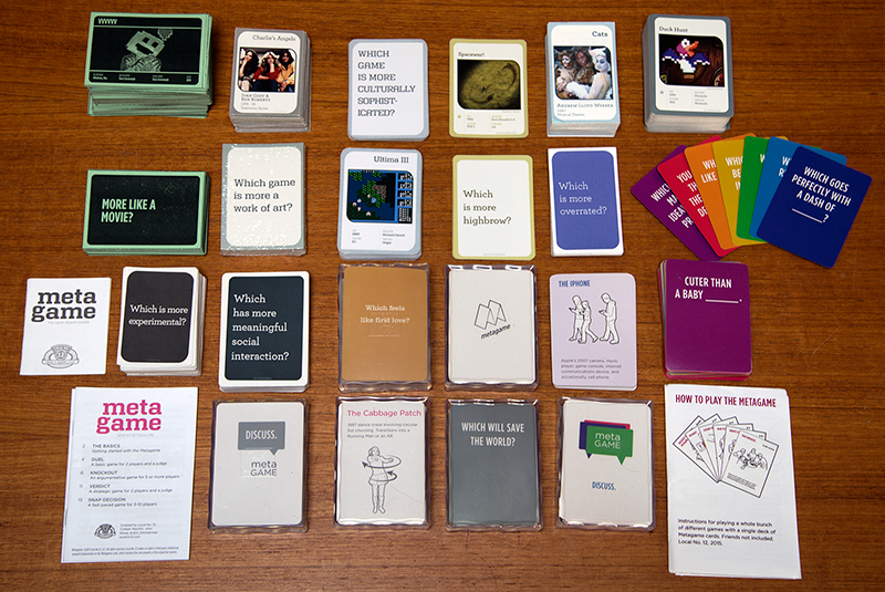
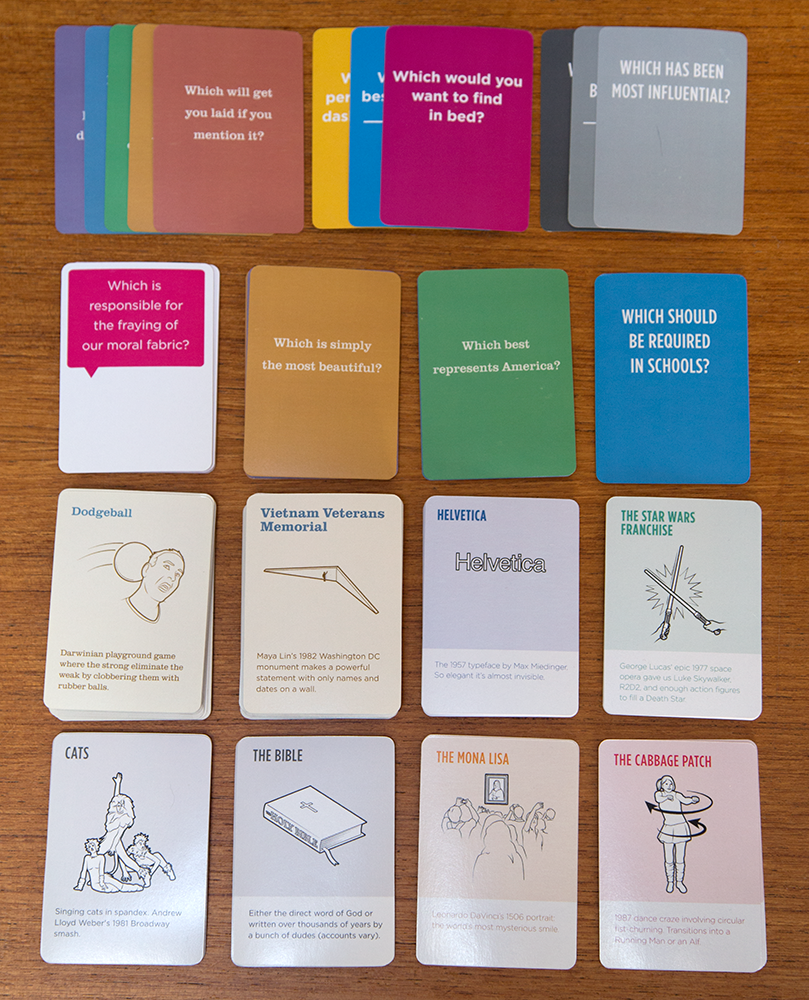
2015: The Metagame.
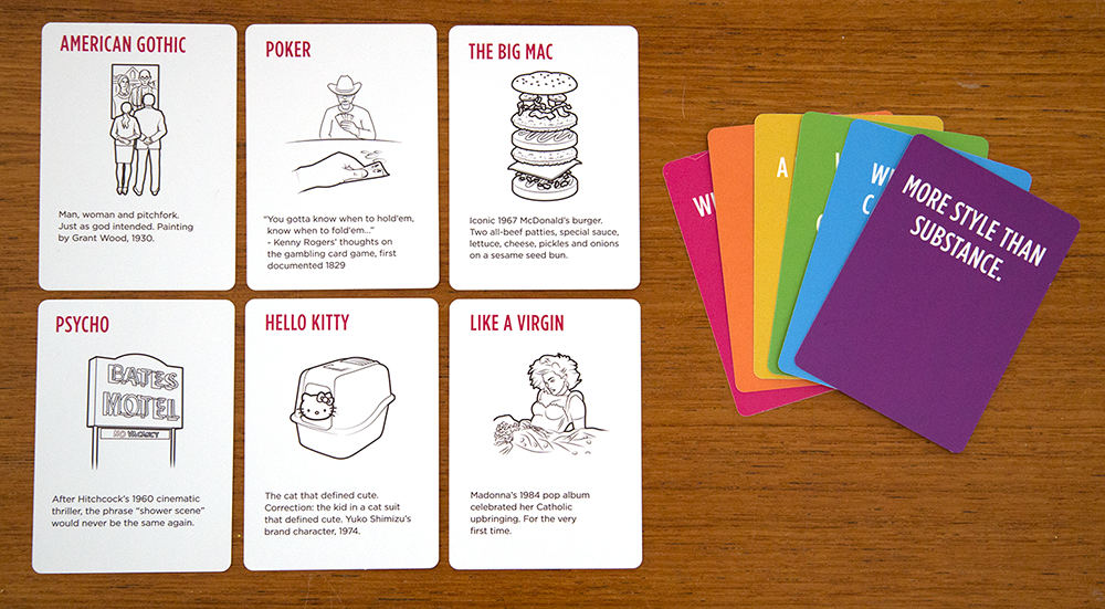
Fall 2014: The final design for The Metagame cards
After months of testing, we landed on the art direction for the game. We honed in on an approach to the culture cards that we think of as “dictionary chic”—a clean sans-serif, a pink accent color (a holdover from the original logo) and dark gray illustrations and descriptions. The opinion cards are all-cap white sans-serif on one of six colors. This rainbow of color provided the pop needed to brighten up the game.
Even with the art direction determined, and our first public images posted on our Kickstarter campaign, we continued to tinker with the point size of the culture card titles and text, the line breaks of each description, the color palette of the opinion cards and the colors of the card backs for the two decks. To insure they worked as stand-alone designs and functional playing cards, we ran dozens of playtests to see how players responded to the art direction and how well they functioned in a variety of contexts (conferences, bars, coffee shops, schools, kitchen tables, etc.).
We then entered the lengthy process of making sure our design translated cleanly to print: paper samples, press proofs, production samples (oh, so many production samples). Given the quiet nature of the design, getting all the details right were important: making sure the box was truly white, getting the alignment of the cards as consistent as possible, Making sure the opinion card fronts and backs were consistent in color, etc.
Looking back at the two conference games, one artist project and two boxed versions of The Metagame, we’re proud of our little game. With each change, the game’s visual design has gotten tighter and more focused. We hope you agree The Metagame—what we think of as the canonical version—has turned out well.